Shapes & text — Starter shapes and lettering
What’s in the Shapes popover?
Section titled “What’s in the Shapes popover?”A curated library of ready-to-stitch starter shapes. The first row is the plain geometry — circle, rectangle, triangle, heart — for the shapes hardest to draw steadily by hand; after those come star, hexagon and the rest, plus a broader set of icon-style artwork (animals, plants, everyday objects). Tap Shapes on the tool rail to open the popover, tap a shape to insert it in the Stitch you have active — a fill preset gives a filled silhouette, a satin preset an outline band in that width, a run preset an outline. The line drawings in the library (hummingbird, paperclip, Saturn and the like) always arrive as a run: their paths outline strokes rather than enclose an area, so a satin band along one traces both sides of every stroke and the shape disappears. They are immediately editable like anything you’d drawn by hand — move, resize, rotate, or send it through Convert to change its stitch kind.
Can I save my own shapes?
Section titled “Can I save my own shapes?”Yes. Select what you want to keep — one object, several, or a group — open Shapes and tap Save the selection as a shape… at the top of the popover. Give it a name; it appears under Your shapes at the bottom of the list. What is saved is the outline: a fill keeps its outer edge and its holes, a run its line, a satin its curve. Everything in the selection becomes one shape, so a flower with three petals and a stem is saved as one entry; an open line beside an area, like that stem, always comes back as a run next to it.
A saved shape lands at the size it was drawn — a 30 mm leaf comes back at 30 mm — and in the Stitch you have active, like the built-ins. Open outlines are saved as line drawings and always arrive as a run. Long-press a shape under Your shapes to rename or delete it.
Can I import shapes, or a pack of them?
Section titled “Can I import shapes, or a pack of them?”The … menu at the top of the Shapes popover has Import shapes or a pack…. It takes a single SVG file, which becomes one shape named after the file, or a .hooppack, a pack of shapes and carve tiles with a name, an author and a licence. A pack shows up as its own section in the popover; the … beside its name removes it again. Importing the same pack twice replaces it instead of doubling every shape.
An SVG arrives clean when it is drawn in millimetres (a width="40mm" in the file), as paths rather than text or images, and without detail under about 3 mm. A filled path is a silhouette, holes included; a stroke without a fill is a line drawing. Colours are ignored — the shape takes your active Stitch.
Share your shapes as a pack… in the same menu writes your own shapes and saved carve motifs as a .hooppack, for a friend or another iPad. Like every way out of the app, it needs the Export Unlock; importing is free. The format itself is public and documented at hoop.stitchpencil.app, so anyone can make a pack — with Affinity, Inkscape or Illustrator, no StitchPencil needed.
What is the Text tool, and how do fonts differ?
Section titled “What is the Text tool, and how do fonts differ?”Tap Text to open the lettering sheet and browse a categorized font library. Fonts fall into two families that stitch very differently:
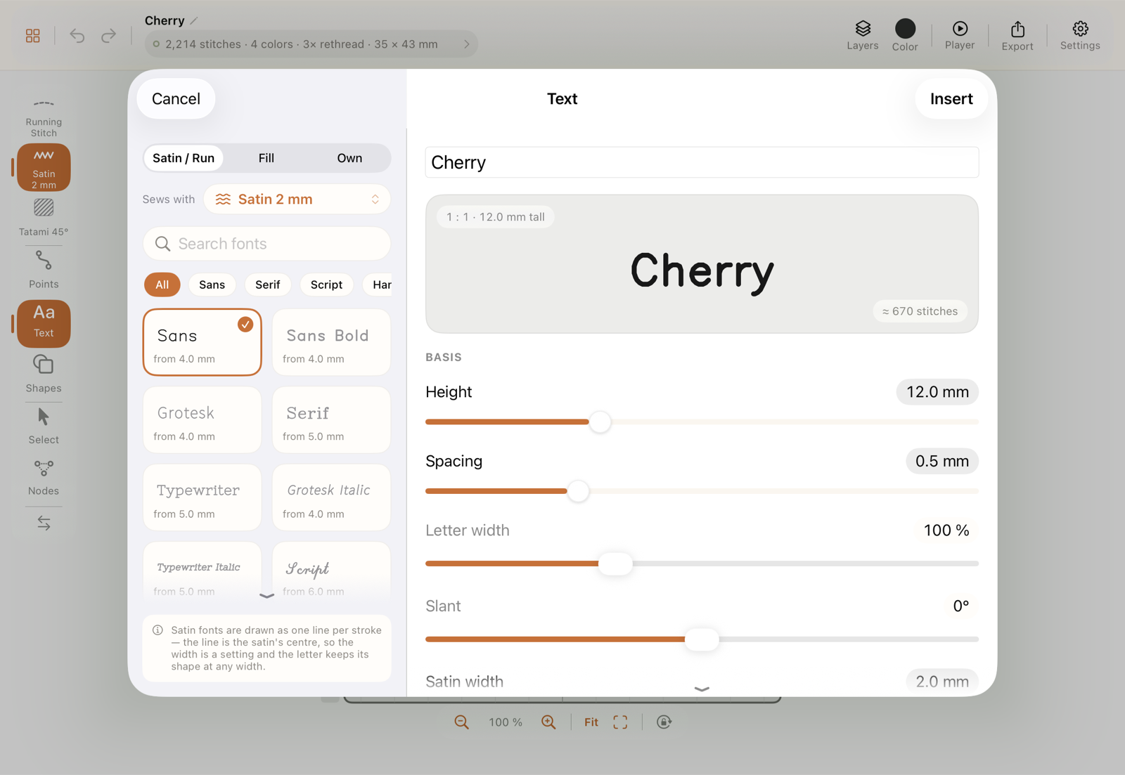
- Satin fonts — single-line letterforms whose line is the centre of the stitching: as Satin (the width is a setting, the letter keeps its shape at any width), or as a Bean or Heavy line. This is the only way to satin lettering.
- Fill fonts — outline letterforms stitched as a Tatami fill, for bold, solid block lettering. Next to the curated faces the list offers the iPad’s own fonts that are bold enough to hold a fill: semibold or heavier, and passing the stroke check on a probe word. Hairline, engraved and script faces stay out — they only fail.
Every shipped font is checked. Every letter from A to Z, a to z and 0 to 9 was sewn at many sizes and judged by what the canvas shows: whether the counters of e, a and B stay open, whether stitches crowd in tight curves, whether curves are round and straights straight, and whether a connecting thread is left in view. The sizes at which the font passes are on its tile, and the Height slider stops at their ends. A font that passes at no size is not in the list. Satin fonts were checked with a satin width of about a ninth of the height, at least 1 mm; sewn wider, small letters close up sooner, and the sheet says so under the width. As a run the fonts are checked the same way, except that a stroke sewn out and back along itself (the middle bar of an E) is allowed; only Sans passes, from 8 to 15 mm. The other single-line fonts have angular curves and pen hooks in their drawings that a run shows plainly — they appear with satin, where the column covers them.
Among the satin fonts you will also find embroidery fonts, marked as such on their tile. These were digitized by hand: every stroke of every letter is a satin column drawn by an embroiderer, with its own width, and shipped under their open licence. They sew as satin only, at the sizes the digitizer allowed and at which they pass the check — the Height slider stops at the ends of that range — and there is no width slider, because the width is part of the letter. Density, underlay and pull compensation still come from your Stitch. Strokes under 1.2 mm wide sew without underlay, under 1.6 mm with a centre run only — anything more would just make loose threads there; the inspector tells you so on the letter.
The two classes are the first two tabs at the head of the font list, Satin / Run and Fill; the third, Own, holds what you added yourself. The active Stitch decides which tab the Text tool opens on — a satin or run Stitch opens Satin / Run, a fill Stitch opens Fill — and you can switch right there. The classes themselves are not interchangeable: a fill font does not become satin lettering, and converting a filled letter to satin gives you a border around the letter, not a satin letter. A word being edited therefore keeps its tab.
For fill fonts the sheet measures the thinnest stroke of your text at the chosen height. Where it falls under what the curated faces have at their size floors — about two thirds of a millimetre — a fill has no room for rows and reads as a smudge; the sheet says so and points you to a taller size or a satin font. The shipped faces carry their checked size range as well.
Can I use my own or purchased fonts?
Section titled “Can I use my own or purchased fonts?”Yes, in the third tab, Own. Add font… takes a folder or its ZIP from the Files app, and the app works out what is inside:
- Letter sets of finished stitches, as embroidery font shops sell them: one stitch file per character, a folder per size, the same again per machine format. Take the ZIP as it was downloaded; a ZIP holding further ZIPs is read too. A font you digitized yourself works the same way: a folder per size (or the size in the file name,
A_25mm.pes), each file named after its character, lowercase asa_lower.pes, because Mac and Windows cannot keepAandaapart in one folder. Names written in words are read too:Upper A 1 Inch.dst,Lower g Half Inch.dst,Number 7 2 Inch.dst,Bonus At 1 Inch.dst. A shop that names its files after the bare character — capitals asAu.pes, the full stop as.pes, the size as the folder above aPESfolder — is read as well, and so is one that runs everything into one word (Font_2inCapA.PES,Font_1.5inPunComma.PES). Letters and digits are found from the set of files itself: a set of files that differ only in one letter — most of an alphabet — is read as the alphabet, whatever words stand around it; only punctuation needs its name. - A pack of several fonts in one ZIP, as shops sell them by the dozen: choose the pack as it is. An overview lists every font it holds, with its sizes and what the reading found; untick what you do not want and import the rest in one go. A font packed as one ZIP per size counts as one font with those sizes. A size whose files were saved lying on their side is turned upright, and a size that lacks characters the other sizes have says so, both in the overview.
Important: the files must be PES, DST or EXP. Many shops let you pick the format when you buy; with only JEF, VP3, HUS or BX in the archive, nothing can be imported, and the overview says which formats it found.
- Embroidery fonts with satin columns in the font-folder layout (
font.json, glyph SVG, LICENSE). They behave like the embroidery fonts that ship with the app. - Fonts of editable stitches (
.hoopfont): a font saved from the Font Studio or shared with you. Its letters are satin columns, fills and lines that are sewn afresh for every height, so the font works across its whole size range. Tap Add font… and choose the file, or open it from the Files app. A newer revision of a font you already have replaces it; an older one is kept out and the app says so.
A font file — TTF or OTF, as computer fonts come — is a fill font, so it goes into the Fill tab: Load font file… above the list takes it from the Files app. It sits between the curated faces and the iPad’s own, marked own font file, and sews exactly like those: the outline becomes a Tatami fill, and the stroke check measures the face on the way in and writes the smallest height it works at onto its tile. A bold, even face is ready at 8 mm; a face with thin strokes gets a higher floor and the dialog holds you to it. Colour and bitmap fonts have no outlines to fill and are refused. Nothing is installed on the iPad — the file stays in the app, and a long press on the tile offers Remove font. Whether a font may be stitched is a question of its licence, not of the app.
A letter set opens an overview before anything is imported: the name (editable), which format is read, the sizes to take or leave, and two sample lines on the baseline. The format is not a question for you — every format holds the same stitches, and the app reads PES, else DST, else EXP. If the archive holds none of them, it says so.
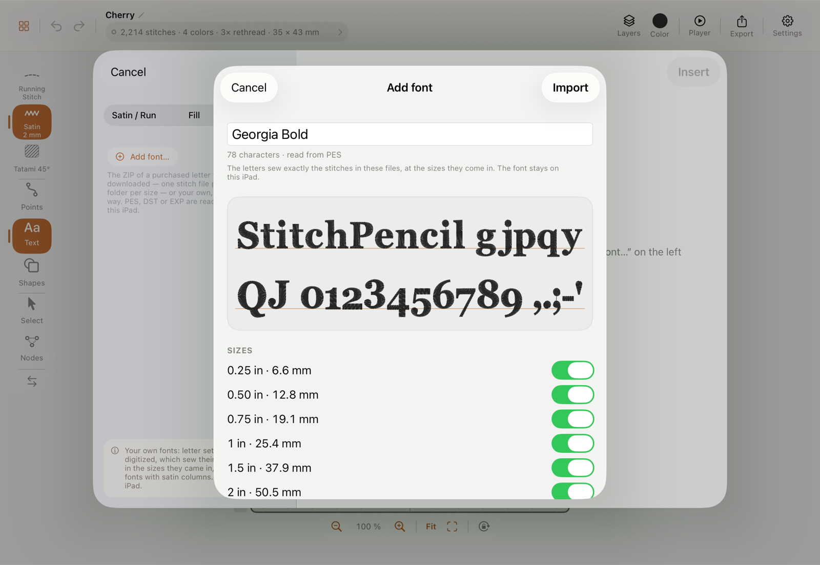
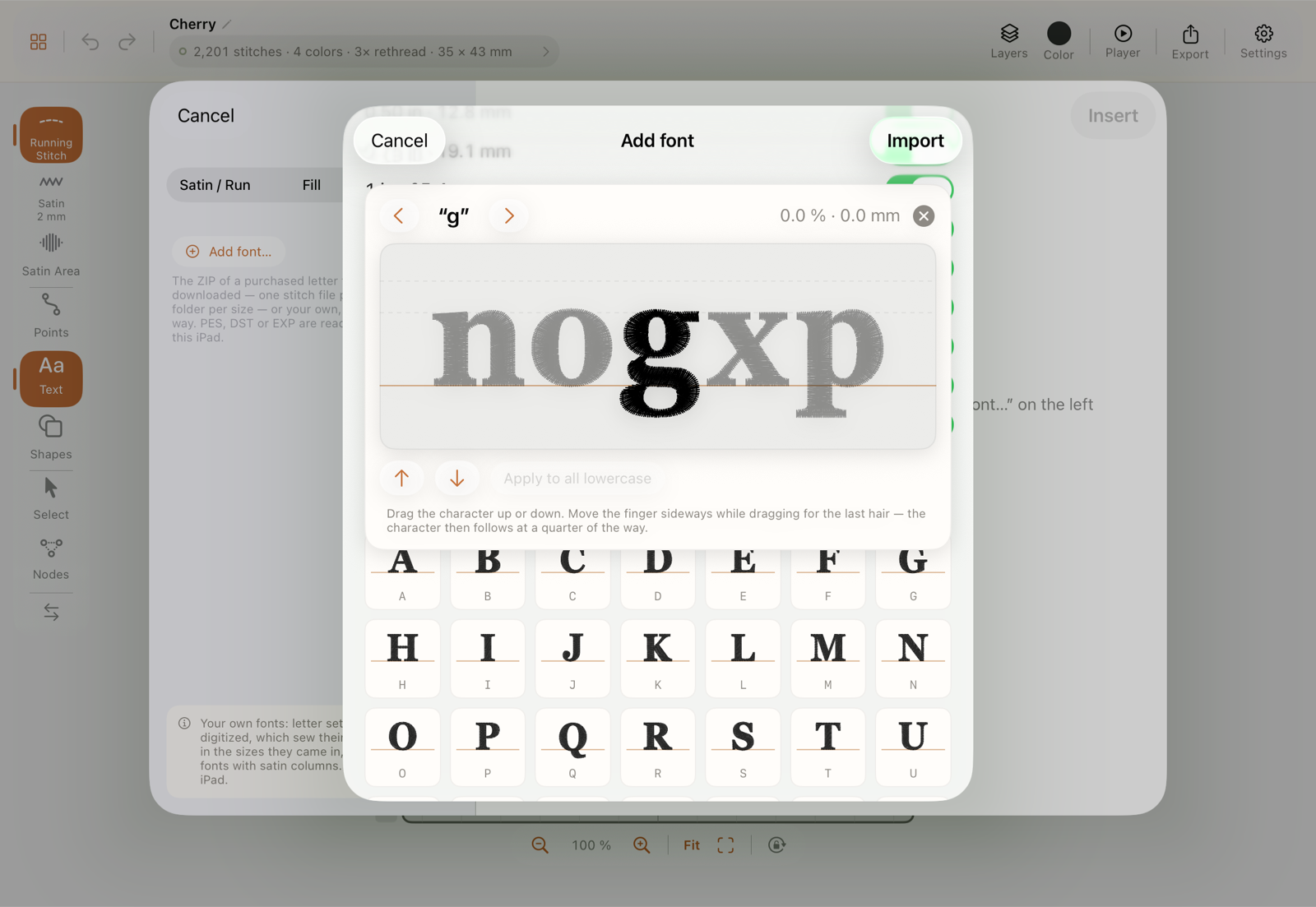
Such files carry no baseline: each is centred on its own middle. The app finds it from the stitches. The reference heights (capitals, x-height, ascenders) come from the font itself, and where a character is taller than its reference, the surplus belongs to its thinner end — a tail is a little thread, a letter’s body is a lot. That holds for a blackletter with hanging capitals. Old-style figures follow their fixed rule: 3, 4, 5, 7 and 9 hang, 6 and 8 rise, and 0, 1 and 2 set the height. In a very ornate font a single character can still sit wrong: tap it in the character grid. It appears large on an alignment bench that stays at the top while the grid scrolls beneath it, between four companions of its own kind (a figure between figures, a lowercase letter between n, o, x and p), with rules for the baseline, the x-height and the capitals. Drag the character up or down with a finger or the Pencil until it stands in line. For the last hair, lead the finger away sideways while dragging: the character then follows at a quarter of the way, and a Fine mark says so. The two arrows move it by half a percent of the capital height; the correction is shown beside them as a percentage and in millimetres. The arrows next to the character step to the next one, and Apply to all figures (likewise lowercase, capitals) hands a correction to the whole kind when a font is off there altogether. Corrected characters carry a small arrow in the grid. One correction serves every size.
If you only notice a hanging character when you set a word: a long press on the font’s tile offers Align characters… with the same bench, without the ZIP. Words already set keep their stitches; Edit text sets them again with the correction. A file whose name does not give its character away is listed under Not assigned, and you type the character. StitchPencil remembers what that word means — the next font from the same shop is read without asking.
Fonts made for 3D puff foam. Some sellers digitize a font for foam: one dense satin layer, no underlay, columns wide enough for the foam to rise under. The import sheet has a switch Digitized for 3D puff foam, set in advance from the stitches — check it against what the seller says. A word of such a font is a puff section: the foam outline, the stop to lay the foam on and the tack run go around the letters, the worksheet lists the foam, and the letters themselves sew exactly as the files have them. A font not marked never goes on foam: a flat font’s cover does not hold the foam down and the excess does not tear off cleanly. The mark can also be set later: a long press on the font’s tile has the same switch, without the ZIP. One word of such a font can still sew flat: the group inspector has Sew on foam for the word, and the font keeps its mark.
Scaling: a word in such a font scales on the canvas by ±10 % only, and that holds after To paths as well. The stitches’ density, underlay and compensation were made for exactly their size and scale with the points — a one-inch letter pulled to three times its size sews a third of its density. For more, pick another size under Edit text; the sheet says when a word is scaled within its size.
Adding a size later, or fixing a character: choose the same ZIP again. The app recognises the font by its name, opens the overview with your corrections from the first time, and ticks what is already installed. Tick more sizes, untick some, or move a character, and tap Update. Sizes this ZIP does not hold stay untouched. Change the name and you get a second font instead. So keep the ZIP; the app no longer needs it to sew, and words you have set carry their stitches in the design.
Such a font sews exactly the stitches of its files. So instead of the Height slider there are the sizes it came in (each digitized on its own — a small one in satin, a large one as a fill), and there is no “Sews with”, no width, no letter width or slant. Spacing, several lines, arc and baseline, and a colour per letter work as for any text. The files know no spacing between letter pairs; a connected script is closed with negative Spacing. A character the font lacks leaves a gap, and the note under the text field names it — purchased fonts often have no umlauts. A capitals-only font sews capitals however you type. Between letters the thread is cut, unless they touch. To paths turns the letters into ordinary stitch layers, as after opening a stitch file. There is no converting finished stitches to satin, fill or run: a stitch path is not an outline, and a satin band along the stitches would be a zigzag over a thousand points. A real satin column is read back with Read as satin column.
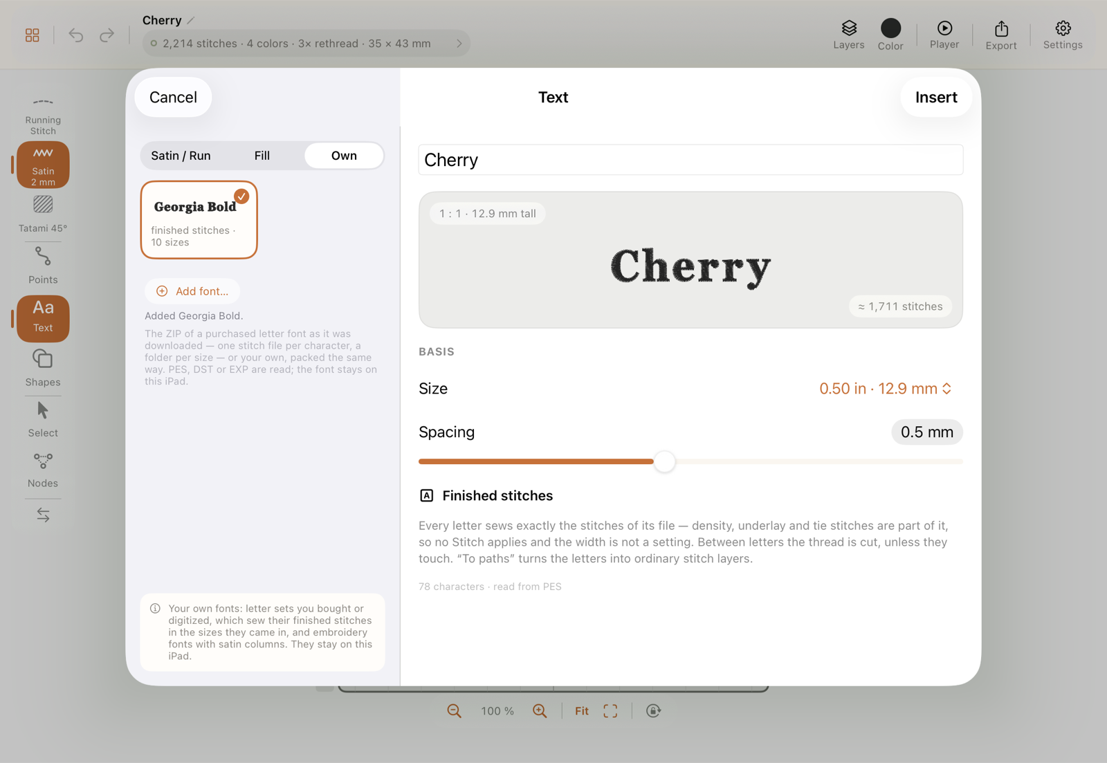
Your fonts stay on the iPad and never travel with a project file; a design holds only the stitches of the letters you set. A long press on the tile offers Align characters…, Rename… and Remove font. The fonts are listed by name: the A–Z button above the tiles turns the order to Z–A and back, and Search fonts shows only those whose name matches what you type; the X at the end of the search field clears it. Each own font has a row to itself: its specimen on top, below it the name in plain type and the sizes you can set it in — the single heights for a font of finished stitches, the range for an embroidery font with satin columns. To clear out several at once, Select above the tiles ticks them; All takes every font that is on screen, and Remove N asks once before it removes them. A font the search has hidden is not removed along with them. Renaming changes the name only: designs that use the font keep working, and the same ZIP still finds its font under the new name.
The files were read wrongly — how do I tell the app how they are named?
Section titled “The files were read wrongly — how do I tell the app how they are named?”Before anything is imported, the app looks at the archive and says what it made of it, in one line at the top of the overview: how many characters it recognised, how many sizes, which format, and how many files stayed unclear or are doubled — with a seal for certain, a question mark for likely, a warning for unsure. Under it stands how the files were read: automatically, with a rule from the catalogue (the known shops), or with a rule worked out from the file names themselves. Archive contents shows the folders as a stack of cards, one per level — size folders, format folders, the font’s folder — with what is left out greyed below (previews, licences, hidden files). A level that not every file has is marked.
If characters are missing or wrong, tap Define rule… (or Adjust the rule…). One real file name of the archive appears as blocks, each saying what it is: the character, the size, the font name, a lower/upper word (lower, Cap), or a word that does not matter. Tap a block to change what it is; blocks of one kind side by side are one block, and Split into words takes one apart. A word that is the same in every file — the shop’s name, say — is written as itself, and that is how the rule tells this shop’s archives from the next. What the folders say does the same for the folder levels: a level can be the size (when the file name has none), the format, or the font’s name. The result line updates while you edit: how many files the rule reads, how many sizes, how many characters, and which files it does not fit. Apply reads the archive again with the rule; ticked sizes and corrected characters stay.
For those who prefer typing, the same rule stands under As a line with placeholders: {character}_{name}_{size}_{case}_FontStation — in German {zeichen} {größe} {name} {klein} {egal} work as well. A word written as itself must stand in the name; the case word is always optional. The line can be copied into a message.
Keep on this iPad saves the rule: from then on it is tried on every font you add, before the catalogue’s rules. Share rule… writes it as a small .hooprule file (a few lines of text); whoever opens it on their iPad — from Files, Mail or a chat — reads that shop’s fonts without doing any of this. A rule file is also accepted by Add font…. The characters you assigned by hand under Not assigned travel along in a shared rule as spelled-out names.
The catalogue of known shops’ rules comes with the app and is fetched from docs.stitchpencil.app once a day while you add a font, so a new shop is a catalogue entry and not a new version. The app settings have the switch for this under Letter fonts, with the date of the last fetch and your own kept rules; see App settings.
A purchased font does not sew the way it should — where can it come from?
Section titled “A purchased font does not sew the way it should — where can it come from?”Three things have a part in a word set in a purchased font: the font’s digitizing, what StitchPencil adds when the word is set, and the sewing itself. It helps to see first which part a problem falls into, because that is the only place it can be solved.
| What you notice | Where it arises | What helps |
|---|---|---|
| Density, underlay, pull compensation; thread breaks, gaps, puckering; how a letter looks at its size | In the font’s stitches. StitchPencil sews them point for point and generates none of it anew. | Pick another size of the font (each is digitized on its own); beyond that, the font’s maker is the right contact. |
| A character sits too high or too low | At import. The files carry no baseline; StitchPencil works it out from the stitches. | Long press on the font’s tile, Align characters…, and drag the character into line. |
| Spacing between letters; a script does not connect | When the word is set. The files carry no spacing between letter pairs; StitchPencil sets a fixed gap. | The Spacing slider — negative for a connected script. |
| The wrong character appears when typing | At import. The assignment comes from the file names. | Choose the ZIP again and check the character under Not assigned or in the grid. |
| A character is missing (often ä, ö, ü, ß) | The font does not contain it. | Pick a font that has it; the note under the text field names the missing character. |
| Cuts, jumps and order between the letters | When the word is set, in StitchPencil. | See below. |
| Fabric, stabilizer, needle, thread tension | At the machine. | A test piece on the same material. |
A simple test narrows it down: sew the same letter once straight from the font’s original file and once from StitchPencil. If both look the same, it is the font’s stitches or the material. If they differ, it is StitchPencil.
StitchPencil does two things to finished stitches: stitches under 0.4 mm are dropped and overlong ones are split, as with any opened stitch file, and a word on an arc turns its letters, whose points then land anew on the machine’s tenth-of-a-millimetre grid. Both stay within hundredths of a millimetre.
If something falls into StitchPencil’s part — baseline, assignment, spacing, the cuts between letters — or the test differs from the original, a report through Report a bug is welcome: with the font’s name, the size, the character concerned and a photo or screenshot. Such cases can usually be fixed for every font at once.
Which Stitch does text sew with?
Section titled “Which Stitch does text sew with?”With the one named under Sews with, directly below the tabs. It is pre-selected from your active Stitch and can be changed there; the choice belongs to this text and leaves your active Stitch as it is.
- Satin / Run lists your satin Stitches and, set apart, one Run entry. Satin width follows the height: about a ninth of it, at least 1.0 and at most 3.5 mm (a single line carries no more). The fonts are checked at this width. You can change it in the sheet; then it stays as you set it. The Run entry needs no Stitch per weight: Passes (1×, 3×, 5×, 7× — odd counts, so the thread ends at the far end of each stroke) and Stitch length are set in the sheet; everything else comes from your active run Stitch. A single pass sinks between knit ribs and reads as basting, three passes are the hand-stitched line. The list shows only what the chosen Stitch can sew: embroidery fonts appear with satin, as they are satin columns; with Run only the fonts that passed as a run.
- Fill lists the fills a letter can carry: Tatami in any of its row textures. The three structural fill modes are not on the list: a Satin area takes its stitch direction from the width of the shape, and a letter stroke has none, so the throws would land across the strokes; Sashiko is a lattice that finds no room inside a stroke; a flow-line fill needs drawn lines a fresh word does not have. With one of those active, the tab opens on the Tatami text was last sewn with, else on the first in your Stitch library.
Editing a word later — the text, the size, a baseline — keeps the stitch the word already has, including an angle or density you set in the inspector: Sews with then reads Current Stitch. Pick another Stitch there and the word takes it. If you want satin letters instead of filled ones, start a new text on the Satin / Run tab — a filled letter cannot be turned into one.
Can I set text on more than one line?
Section titled “Can I set text on more than one line?”Yes — press Return in the text field and the next word starts a new line. A two-line name tag stays two lines.
Two settings appear as soon as there is a second line, and stay hidden while there is only one:
- Line spacing as a multiple of cap height, 1.0× to 3.0×, with the resulting distance shown in millimetres beside it. A multiple rather than a fixed length, so resizing the whole text keeps the lines in proportion.
- Alignment — left, centred or right — for how lines of unequal length sit against each other.
The block grows downward from the first line, so adding a line does not move what is already placed, and a blank line keeps its space. Everything else works on the block as a whole: width and slant, the Stitch, per-letter colours, and a drawn baseline, which carries the second line parallel to the first rather than flattening both onto the curve.
Can I make a font narrower, wider or slanted?
Section titled “Can I make a font narrower, wider or slanted?”Yes — two settings in the text sheet, under Height and Spacing.
Letter width sets how wide the letters are drawn relative to their height, 50 % to 200 %, with 100 % the width the face was designed at. Narrow a name to fit a small hoop without making the letters shorter; widen one to fill a jacket back. The spacing you dialled in is left alone — it is its own setting, so condensing the letters does not silently close the gaps too.
Slant leans the letters, −30° to +30°, giving an italic to faces that do not ship one. The shear is about the baseline, so the letters keep standing on the line rather than sliding off it. It does not change the spacing either.
Reset width and slant appears once you have moved either one, and puts both back. Both settings apply to stroke and filled fonts alike, and a design saved before they existed opens exactly as it was.
Can I use umlauts and accents?
Section titled “Can I use umlauts and accents?”Yes — ä ö ü, é è ê, ñ, å and the rest of the common accented letters work in every font, upper and lower case. Where a face was drawn without them, the mark is composed: the letter plus its own small stroke, sitting on the letter’s shoulders. That is how the machine sews an accent in any case — the needle lifts between the letter and the mark.
ß is the exception. It is a letter in its own right, not a letter with a mark, so a font either has it or does not — twenty-three of the thirty stroke fonts do, seven do not. Nothing is invented in its place: if the font you picked cannot draw a character, a note appears under the text field saying so and naming fonts that can. Write ss, or pick one of those fonts.
Can I put text on a curve?
Section titled “Can I put text on a curve?”Yes, three ways, all under Baseline in the text group’s inspector. A baseline is a guide only — it is never stitched.
Bend is the quickest, and the one most words want. The slider says how many degrees of a circle the word itself covers: to one side of the middle it arches up, to the other it curves down, and at 0 it stands straight. The line is not drawn here, it is derived — so the arc always belongs to the word standing on it. Retype the text, change the face or the size, and the arc re-fits itself around the same point instead of leaving the letters hanging off the end of yesterday’s curve. Turn it far enough (from about 280°) and the arc closes into a full circle: a word wrapped all the way round, which is what a badge wants.
Draw baseline puts the Pencil in your hand: draw one stroke and the word lands on it. The line is smoothed like every other stroke you draw, and if you bring it back to where it started, it closes into a ring the word runs around.
From a shape takes the line from something already in the design — the shape library’s circle is a true circle, which no hand can draw. The path is copied, so the shape itself stays what it was: still sewn, or deleted afterwards, as you like.
A drawn or borrowed line gets one more control. Position moves the word along the line. Drag the dot on the baseline with the Pencil and the word travels with it — that is the whole gesture; the slider is there when you want an exact number. Either way the word’s middle sits where you put it, and the whole drag is one undo step. 0 % is the line’s left end, whichever way you drew it. Dot and slider stop where the word would leave the line: the whole text stays on it. When the line is shorter than the text, the inspector says so with the missing length in millimetres and the middle stays in the middle; draw a longer line then, or make the text smaller. One more thing about shape: each letter is a rigid block, turned to the line at its own spot. On a bend whose radius is smaller than the letter height, the letters run into each other. A wave for 25 mm letters needs bends well wider than 25 mm. The dot and the dashed baseline appear while the word is selected with the Select tool; the dot takes the app’s accent colour. Flip puts the text on the other side of the line and turns it round in one act; it already starts on the readable side, so you only need it when you deliberately want the other one — the underside of an arch, for instance. Straight again takes the line — or the bend — away, and the letters return to their row.
Move, resize (from a corner handle) or rotate the group and a drawn baseline goes with it, keeping its size relative to the letters. A bend needs none of that: it is an angle, and an angle survives any size. An edge handle stretches unevenly, which a typeface cannot do, so that converts the group to plain paths — undo brings the text back.
The letters stay the shape the font drew them: each one is rotated as a whole, not bent. That reads better on a tight curve — and when a curve is too tight for the size, the honest fix is a gentler curve or smaller letters, not a distorted letterform.
How do I put text at the start, at the end, or over the whole line?
Section titled “How do I put text at the start, at the end, or over the whole line?”With a drawn or borrowed baseline, the inspector shows the row On the line above Position, with four buttons:
- At the start — the first letter begins at the start of the line.
- In the middle — the middle of the text sits on the middle of the line.
- At the end — the last letter ends at the end of the line.
- Over the whole line — the text reaches from the start to the end. The letters keep their shape and width; what the line has left in length is shared evenly among the gaps between them.
Start, end and whole line are rules, not places: retype the word, pick another font or size, and the text still begins at the start of the line, or still fills it. Start means where the text begins to read, also after Flip. Drag the dot on the baseline or move the Position slider, and the text lies where you put it again.
A ring has neither a start nor an end. There the switch All the way round takes their place: the text runs once around, and the gap between the last letter and the first is as wide as all the others. Where on the ring the text begins is still set by Position, and the dot on the baseline turns it too, all the way round or not.
If the text has several lines, each line fills the path on its own, with its own gaps.
If the line is shorter than the text there is nothing to share out, and the letters stay as close as the font sets them. An arc from the Bend slider has no such buttons: it is made from the word and always fits it.
Can I set text at a distance from the line?
Section titled “Can I set text at a distance from the line?”Yes, with Distance from the line, again for a drawn or borrowed baseline. The value lifts the whole text off the line, in the direction in which the letters point up; below zero it sinks under the line. That puts lettering 3 mm inside a patch border whose outline supplied the baseline, instead of on the border.
On a curved line the distance also changes the space between the letters: on the outside of an arc they move apart, on the inside together. With a large distance on a tight arc, even that out with Spacing in the text sheet. Scale the word and the distance from the line scales with it.
Can I move a single letter without converting the text?
Section titled “Can I move a single letter without converting the text?”Yes. Tap the word with Select, then tap the letter once more, or pick it in the Layers panel. The letter then has a frame without handles. Drag it into place. The guides and Nudge for exact steps work as for any object.
The word stays text. The offset belongs to the letter and is kept when you
- change the text: what stands before or after the change keeps its offset; a letter you retype stands in line again,
- change the font, the size or the spacing (with the size, the offset grows along),
- move, rotate or scale the word (the offset scales with it),
- bend the baseline or draw one: the offset counts along the line and across it, and turns with the letter.
A border or contour that follows the word follows the moved letter too.
Reset position in the letter’s inspector puts it back in line. Letters back in line in the word’s inspector does that for all of them at once; the button only appears when a letter has been moved.
Moving is the one thing a single letter of live text does on its own. Rotating and scaling apply to the whole word; select the word for those. For anything else on a single letter there is Convert to paths.
Can I change the font of a word I have already placed?
Section titled “Can I change the font of a word I have already placed?”Yes. Select the word and tap Edit text: the sheet opens with the word’s text, font and Stitch. Pick another font in the same tab, or switch the tab — Satin / Run, Fill or Own — and the word is rebuilt from the new font when you tap Apply. Text, position, a bent baseline and letters you coloured individually come along — a coloured letter stays the same letter, whatever the new font does with spaces; an outline or border that follows the word is rebuilt around the new letters.
What does not cross a tab is the Stitch: Current Stitch is only offered while the word stays in its kind, and a switch picks the tab’s own Stitch, shown under Sews with. A font of finished stitches comes in its own sizes, so the word takes the nearest one. Going back to a tab brings back the font and the size it had, so looking at another tab costs the word nothing. One Undo restores the word as it was.
Can I edit letters after placing text?
Section titled “Can I edit letters after placing text?”Yes — use Convert to paths to turn live, still-editable text into ordinary path objects (one path per letter), after which you can node-edit individual letterforms exactly like any other shape. Once converted, text is no longer “live” (you can’t re-type it), so do this once you’re happy with the wording. Converted letters collapse into one row per letter in the Layers panel, with a chevron to disclose each letter’s individual node-editable path.